

Brand & Proposition
Focusrite — Removing barriers to creativity
User story
As a Focusrite customer, I would like to find and download my bundled software easily, so I can get on with being creative.
Objective
Produce a design system which can be filtered to show certain types of entries. Also reduce the cognitive load and time spent on pages wherever possible, resulting in a much simpler journey for the user to get to where they need.
Context
One of the lead selling points of a Focusrite product is the free software which is bundled with it. When a customer purchases a Focusrite product, they are encouraged to register it online — in return, they get access to their bundled software via the 'My Account' section of the website.
The original 'My Software' section (flat)
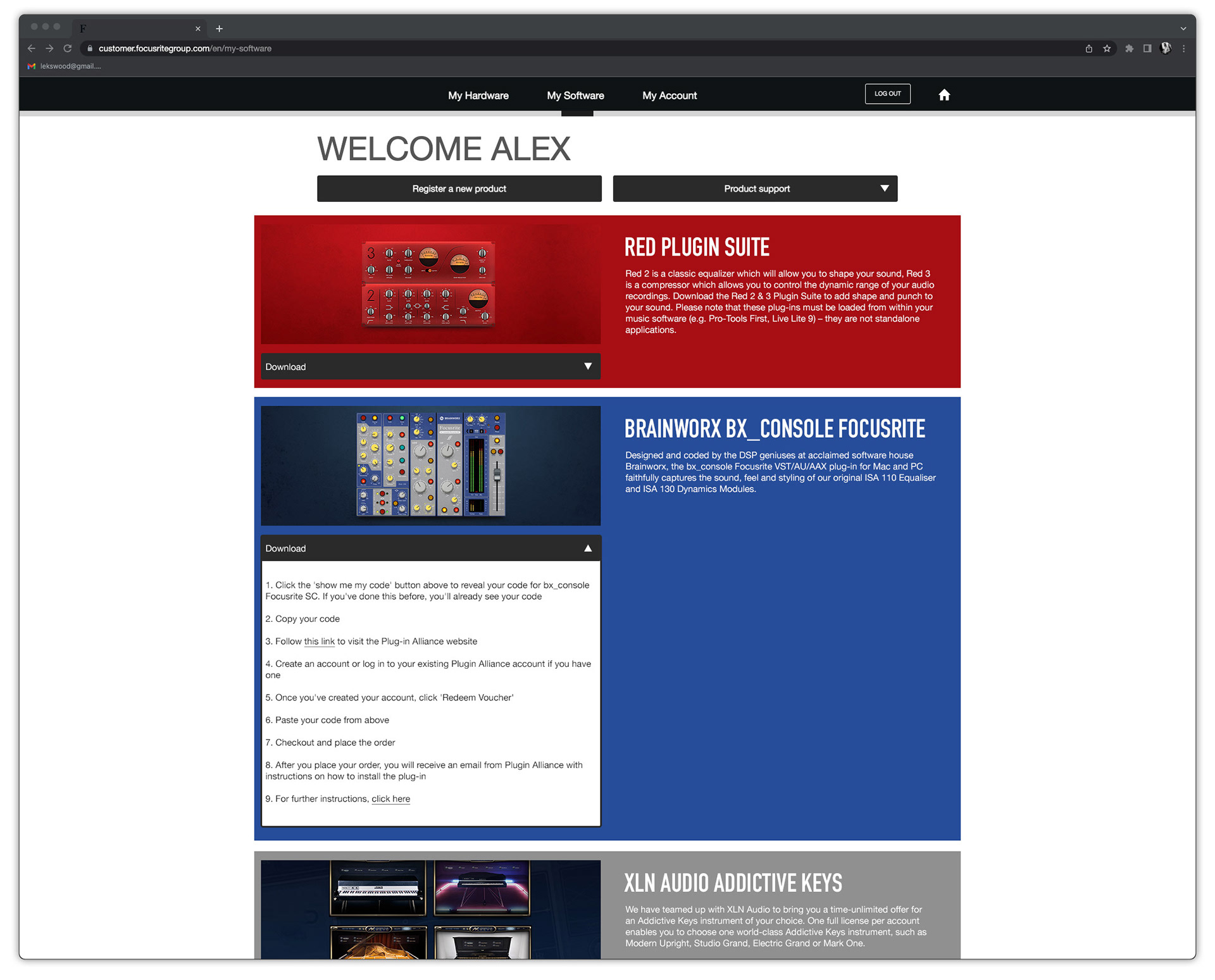
The original 'My Software' section had two major flaws:
Firstly, the organisation of information. All the items of software were displayed in one seemingly endless scroll, with instructions on how to redeem each item contained within a drop-down box, attached to each item. These instructions varied dependent on the software, so some of these boxes became pretty long and unsightly. Not a very clear and simple experience for the end user.
Secondly, it lacked any functionality to allow for filtering of different software types. Being displayed in one long scroll made it impossible to jump to a certain type of software easily. Not ideal if you know what software you are after, and want to get to it quickly.
In an effort to improve the experience of this section, we opted for a card-based layout, each with a click-through to it's own dedicated page where serial numbers, installation instructions etc. could live.
Wireframe stage (prototype)
During the redesign process, a card sort was conducted to determine how items of software are most commonly categorised. We landed upon the following categories:
DAW, Audio FX, Instrument, Sounds, Utility, Tutorials
The outcome suggested that all of the software permutations bundled with each Focusrite product (across five ranges) could be neatly pigeon-holed into these six categories. Each category was assigned a colour to help create a visual tie to the filtering UI.
Design stage (prototype)
What was deployed (flat)
